ResourcesEverything in One Place
What Makes A Good Website?
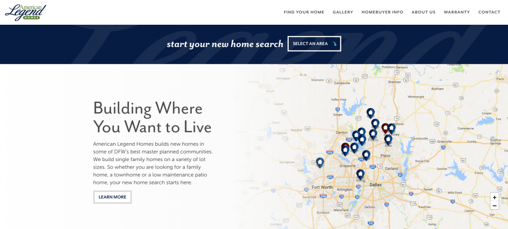
Seventy-five percent of new homebuyers spend up to a year doing research before they ever step foot inside a model home or sales center. What are they doing during this time? Looking at websites, mostly. They’re searching for ideas, checking out home builders, reading customer testimonials (and paying particular attention to rants). They’re going to third-party sites, like Zillow and Realtor. You’re being watched and you don’t even know it. These active browsers are trying to see who is building what and where so they can narrow their search before they hit the road and visit model homes. They want to see the types of homes you build and glean some information on your approach to building and customer service. In short, they want to know all the answers they can before asking you a single question. Knowing all that, browse your website like a visitor. What do you see? Is each page visually appealing? Does it look current, or like it’s been ignored for months or years? If so, what does that say about your attention to detail and your concern with being up-to-date? Does it actually make customers want to visit your model home or sales center? You should think of your website as an online model home. You wouldn’t allow your model home or sales staff to be sloppy. You wouldn’t ignore visitors who stopped in. This is your first—and possibly, only—opportunity to entice and excite a prospective home buyer. Make it count.
What are they looking for?I always tell home builders to get out of their own heads and think like a home buyer. What would you want and need to see on a website to move ahead on your path to purchase with a builder?
Great photos
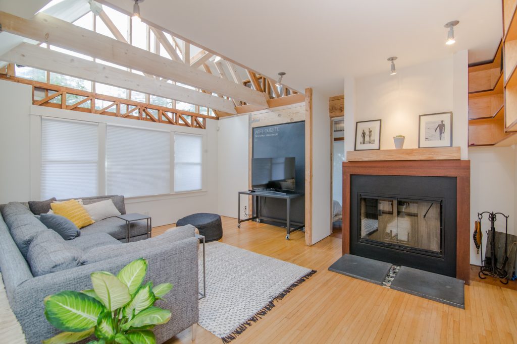
Professional imagery will make a far better impression than photos you grabbed without styling a shot. You’d be surprised how many times something in a photo distracts and deters a buyer. A dead patch of grass, handprints on a stainless steel appliance, or (my favorite) the reflection of the person taking the photo showing up in the shot. Pictures are worth a thousand words, so make sure you’re using each one to truly sell your product.
Professional-quality videos
Again, make it professional. Don’t skimp. A high-quality presentation with virtual tours of communities and homes elevates your quality in the mind of the viewer and will impress them way more than a shaky video taken on your phone. One out of every two home buyers say videos are one of the most useful tools in their decision-making process. For something this important, do it right.
Well-crafted content
The words on your site must be crafted, not written. There’s a unique formula for web content that blends engaging, brief, and targeted copy with the technical integration of keywords. Those keywords are bait for the web’s crawlers (bots and spiders) that seek out relevant pages and sites to deliver to people doing an organic search. It’s not enough to just dump keywords on a page and hope to be found – search engines have gotten smarter, and they check to make sure your website is actually helpful and relevant to those keywords. If your writer doesn’t know how to use keywords correctly, you won’t be found unless someone searches for you by name.
Dynamic content
Once you launch a new website, you’re not done - you’ve only begun. Those bots and spiders are also looking for sites that are active, meaning regularly updated. The staler your content, the further down the results list you’ll fall. Add articles and blogs on a weekly basis. Refresh your photos. Upload links to articles that might be of interest to your home buyers – or, better yet, paraphrase them in your own words before linking out, so buyers can get your perspective on the article as well.
Call to action
Every page should feature your contact information and a call to action. Don’t assume home buyers know the next step – you need to guide them through this process. Give them the option to get more information, talk to a sales consultant, schedule an appointment, or join your mailing list to receive updates. Building a new home is one of the biggest financial decisions of your buyers’ lives – you want to make sure that process is positive and streamlined.
A Friendly Interface
Your site should not frustrate your users. Is the content easy to read, or is the text too small when they open it up on tablets or their mobile phone? Does the site respond when the screen shrinks down, or does it start cutting off text and images? Are the calls-to-action still front and center on smaller screens, or are they hard to find? If your customer can’t use your website successfully, they’re unlikely to come in at all. A good rule for knowing when you need to update your website is ever 2 to 3 years to stay relevant to current trends and technology.
What is the best website?The answer is easy. The one that’s found. If a home buyer can’t find your website, you’re not even in contention. It doesn’t matter if you’ve followed all the advice I’ve outlined here. Without search engine optimization (SEO) your website is like a really great restaurant tucked away off the beaten path, with no advertising. How likely is it that diners will find that restaurant There are some simple ways to increase organic traffic to sites – for example, one advertiser increased traffic by 20% just by increasing the content length from 500 words to 1,500 words. What that doesn’t mean is stuffing your site full of filler words just to hit that number – Google also values quality. If you wouldn’t want to share, read, or engage with the information you’re posting, don’t put it on your site. A great website is the perfect blend of intelligent design, content, and SEO. If you need help with your builder’s website, talk to me. The longer you postpone the conversation, the more buyers you’re missing.
Latest Posts
February 19, 2025 | EBook
2024 Builder Data Year In Review
December 19, 2024 | Blog
Mortgage Rate Projections: Two Paths Forward or Uncharted Territory?
October 17, 2024 | Podcast
INBOUND 2024: AI Trends, HubSpot Innovations and More
October 3, 2024 | Webinar
We Know What Works Replay
October 1, 2024 | Blog
Buyers Saved Just $20/Month on Their Mortgage This Year – Here’s Why It’s Happening
September 26, 2024 | Blog
How the Fed Rate Cut Could Impact Mortgage Rates: What Builders Need to Know
September 19, 2024 | Blog
We Know What Works—Builder Designs’ Proven Strategies for 2025
August 9, 2024 | Podcast
Builder Buzz | Essential Takeaways from the 4ps of Marketing
August 5, 2024 | Podcast
Builder Buzz | Proving Your Value through Promotions
Previous Article

Stop Doing Everything
Next Article


